Skyscanner

Overview

This project was carried out as part of a UX course to improve the user experience of Skyscanner.

The problem

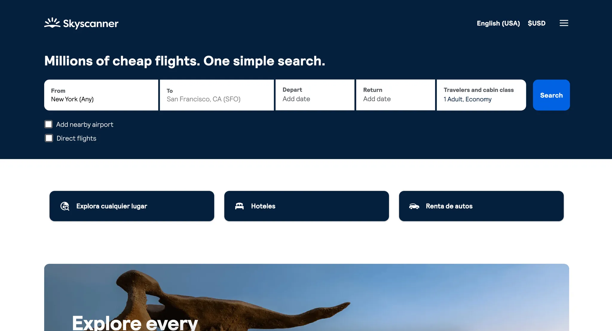
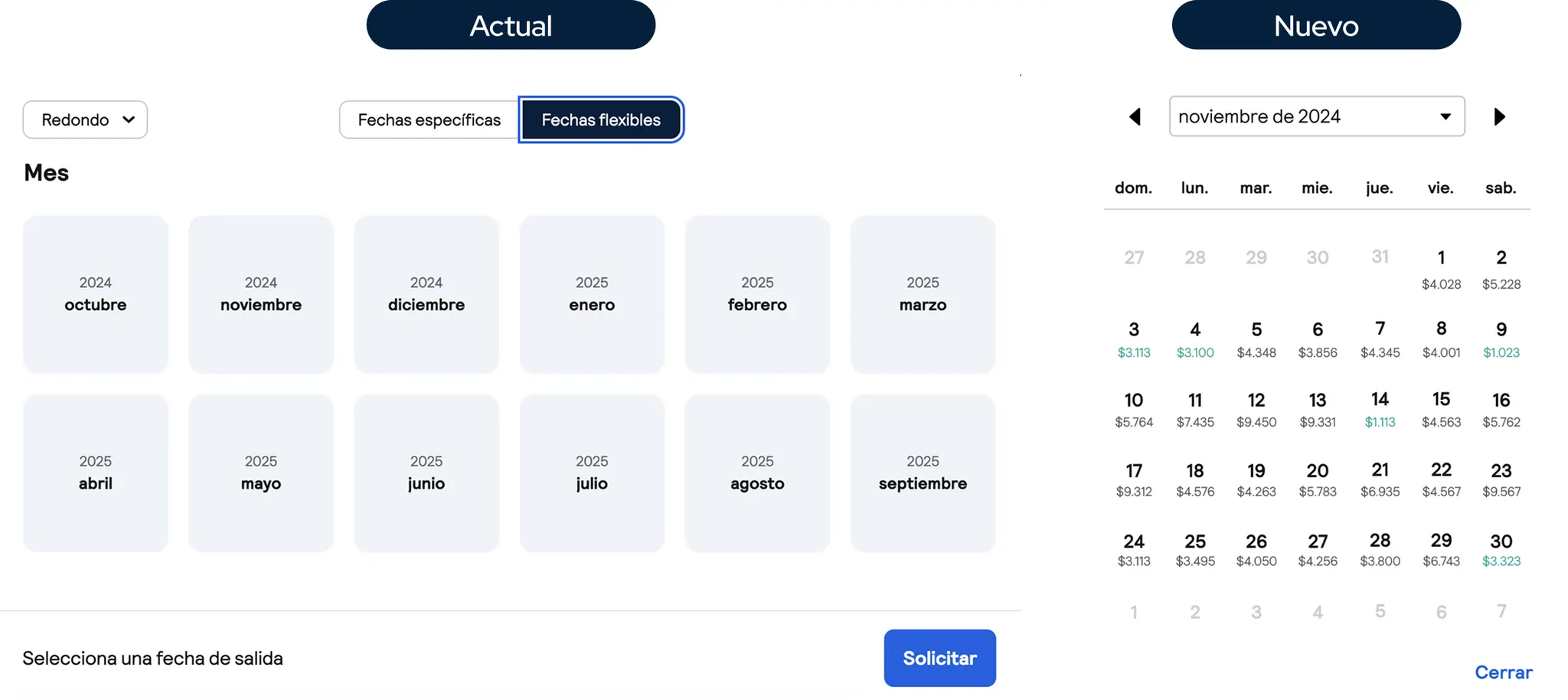
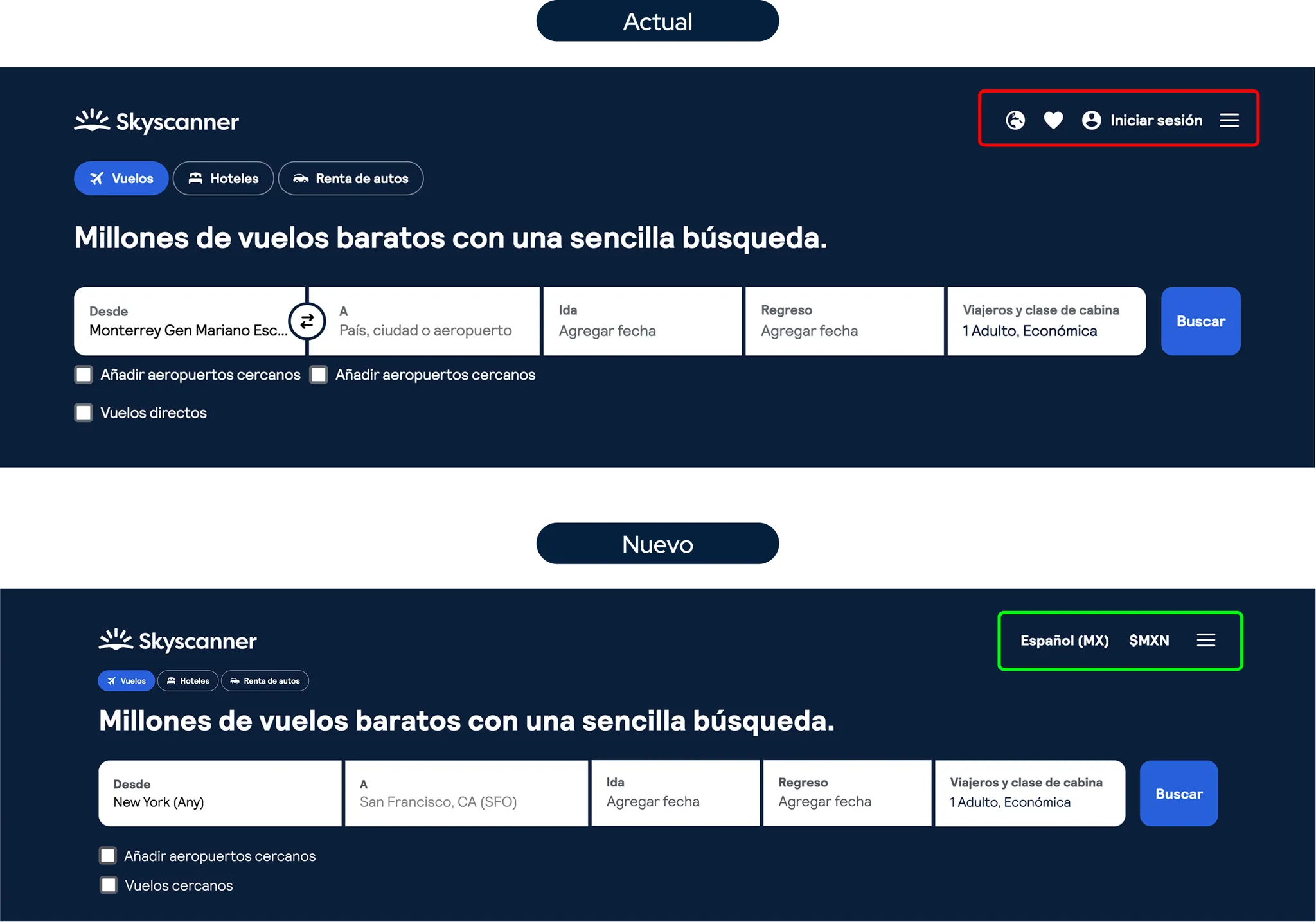
The user experience on Skyscanner is affected by the difficulty of comparing real flight prices and the complexity of the booking process due to issues with information presentation, hidden fees, and redirections to other sites. Additionally, the currency change option is not intuitive, making it challenging for users to view prices in their preferred currency, affecting cost comparison.

Design Process

  1. Research: Heuristic analysis, surveys, and benchmarking.
  2. User Persona & Journey Map: Defining the target user.
  3. Wireframes & Prototypes: Designing in Figma with interface and flow improvements.
  4. Usability Testing: Validation with users for iterations.

Final Solution

The redesign proposed:

  • Direct booking without redirections.
  • Transparent price calendar.
  • Intuitive filters.
  • Better organization of information.

User tests demonstrated increased navigation efficiency, allowing users to find information faster and with less friction. This resulted in a clearer, more attractive experience that aligned with user needs

This project solidified my skills in research and usability testing. I learned the importance of addressing the user experience from an integral perspective, combining usability and brand communication to offer more effective solutions. Additionally, I reinforced the importance of constant user testing to make decisions based on their real needs.